
Software as a Service Design
Client: Wand Corp
WAND Corporation provides products to the restaurant industry and has become a leading provider of digital menu board systems. WAND provides the physical displays and a software as a service platform to control the displays.
I worked with a team of five designers to discover improvements to the SaaS platform in order to improve usability and to make the software easier to learn.
METHODS
Website Diagram
Cognitive Walkthrough
Comparative Research
Surveys
Nomenclature Development
Contextual Interviews
Wireframing
TOOLS
SurveyMonkey
Draw.io
Miro
Balsamiq
Sketch
DELIVERABLES
Website Diagrams
User Task Flows
Wire Frames
Recommendations Report
Implementation Plan
Overview
Client
Historically, WAND has provided point-of-sale systems and back-office management software for quick-service and fast-casual restaurants. More recently, WAND has expanded into the digital menu board business, particularly focusing on customers in the corporate campus dining sector.
WAND’s menu boards display images and video, food items, prices and caloric content in a way that transforms the traditional static menu into a marketing tool, increasing up-sales and improving efficiency and flow by helping customers select food more quickly. WAND’s goal is to maintain their current customer base and expand their Campus dining business.
Design Process
Empathize with Users
Research
We began the project by researching competing businesses and exploring WAND’s software through a heuristic analysis and cognitive walkthrough. We created assets and attempted to build a menu board.
Internal Interviews
We conducted extensive interviews with the customer service and sales staff at WAND who have the most contact with customers during the training process and through customer service situations.

Usability Interviews & Survey
WAND introduced us to customers who they felt would be willing to participate in our user research. Unfortunately, due to the pandemic and quarantine, many subjects were furloughed and unavailable to participate, but despite this challenge we were able to connect with a small but very insightful group of participants.
Every person we interviewed described the taxonomy of features used in the software as a challenge. This feedback led us to create a survey targeting the language choices which we sent to WAND customers as well as non-WAND chefs and the general public.
Insights About Users
We found it helpful to identify users in three categories.
Quick Serve/Fast Casual Users are typically regional managers or marketing staff who control the boards at many restaurants (sometimes hundreds of sites). This user type is a single power user, managing the boards at many sites, and the boards are updated monthly or seasonally as required.
Campus Dining Users include corporate marketing staff who control the content (branded photos, promotions, and prices) and the chef for each campus site, who controls the daily offerings that appear on the boards. In this case there are two user types, a corporate level user responsible for the digital assets used at many locations and the chef for each location, who builds menu boards (daily) for each food station and each meal service.
Wand Staff Users - We learned that for some customers, WAND offers a premium service where WAND staff maintains the menu boards, per request on behalf of the customers.
Research Deliverables
Our research led to a variety of pieces which helped provide a framework for the project.
A user task flow showing the steps required to build a menu board display.
A site diagram showing locations of those tasks in the navigation.
Customer profiles (for each type of business) showing specifically which people within each organization were involved with completing each of those sequential tasks.
A trello board, to serve as a list of usability issues we discovered in talking to each of those different users.
Graphics to show visually the meaning of the language used within the WAND software, and then also to demonstrate how it should change.
Site diagram showing location of menu board building tasks.


Task flows showing different points of user interaction with the WAND system.
Visual aids to conceptualize WAND SOFTWARE taxonomy.


Define Challenges
Navigation
The navigation is unnecessarily narrow/deep and confused by a filter that is positioned above the left vertical navigation.
Taxonomy
All users said the language used to define features was a major pain point.
Organization
The steps required to build and schedule a menu board are sprinkled throughout the software without anything to lead the user through the process.
Local Usability Issues
We discovered many small usability challenges which, taken together, crippled the usability of the app. For example:
The UI for selecting items from a list cannot accommodate the number of items displayed.
WAND uses color to indicate status in unclear ways.
Users find the process of selecting a menu board display screen (to edit) very confusing. Wand uses a filtering process to set concept (franchise name), company (the designation for a single restaurant) and store (which is the category of screens within a restaurant…i.e. countertop ipads or drive-through menu display).
Integrations
WAND’s biggest quick-serve customer stores menu data in a Smartsheet for which WAND built a custom integration allowing WAND to pull data from the Smartsheet. WAND’s biggest campus client uses two other platforms to maintain data (MenuWorks and Webtrition). Wand built custom integrations allowing Wand to connect to those platforms and use data stored externally.
The integrations make the platform much more difficult to support.
Some features within WAND don’t work because of the data flow/storage.
Wand is also vulnerable to reliability issues originating in the connected platforms which they have no ability to fix.
Training
WAND is frequently engaged when a campus dining site is being opened. The menu board installation and training of staff is just one element in that much larger project. This is the worst time to expect a chef to devote bandwidth to learning a new platform.
For campus dining clients, they must be proficient in MenuWorks and Webtrition to use the WAND system. WAND frequently has to train chefs who haven’t learned the other platforms, which is nearly impossible.
My Role
I worked with a team of four other designers/researchers on this project. My role was to digest the complexity of the software and understand how different users came into contact with it at various levels. I created website diagrams and user task flows. I designed the layout and user interface of the flow used to build a menu board presentation. I also designed the implementation plan, helped create training materials and assisted in compiling the recommendations report.
Ideate & Wireframe
Based on our team’s research, we built high fidelity wireframes to demonstrate our solutions to the challenges we discovered.
Navigation
The platform is designed with navigation that incorporates the Menu Board functionality along with other WAND products (point of sale, back office, ect.). However, most customers only use the menu board piece. When the navigation for the other products disappears, it leaves the user with an unnecessarily narrow and deep nav.
Solution: In the long term we recommend that WAND rework the dashboard concept to show the WAND products, but have a separate navigation, optimized for each product.
Also, users find the process of selecting a physical screen (to edit) very confusing. The controls are nested inside the navigation in an awkward way.
Solution: We moved the filter away from the left navigation and placed it at the top, to help indicate that it is separate from the navigation. We also added filter tiles, which remain visible across the pages, so users would always know which concept/company/store they have selected.

Original Navigation

New Navigation
Organization
The steps required to build and schedule a menu board are sprinkled throughout the nav. Nothing leads the user through the sequence; it’s not intuitive.
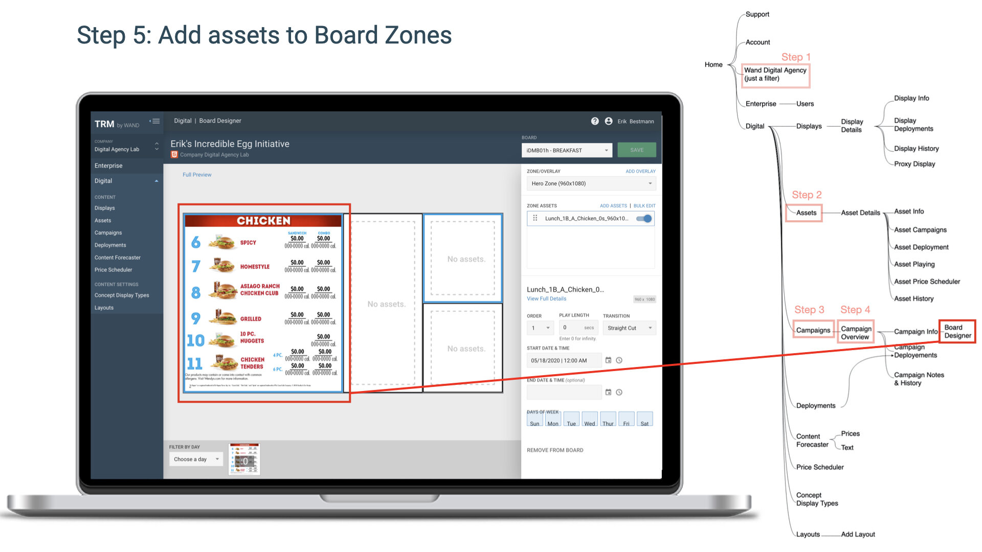
Solution: We assembled the pages required to build a menu board into visible task flow, organized by tabs, with simple instructions, to lead users through the process.


Taxonomy
All users said the language used to define features was a major pain point.
Solution: Based on our survey, we found a more intuitive taxonomy of features.
Display changed to Screen
iPad/tablet, monitors, televisionsDeployment changed to Publish and Collection
Publish is the action of making a menu board appear on the screen
Collection is a list of media, sequence of videos, and content grouped together scheduled for dates/times.Content Forecaster changed to Preview
Review grouping of media, check dates and confirm workCampaign changed to Presentation
A collection of menu boards (and each board’s playlists of media and in-board micro schedule) as well as a macro schedule for the presentation to start and end.
Local Usability Issues
We discovered many small usability challenges which, taken together, crippled the usability of the app.
The existing UI for selecting items from a list cannot accommodate the number of items displayed.
Solution: We added “results per page” as well as page forward/back functionality. Long-term, we also recommended WAND build the capability to remove old/obsolete items from lists and the ability to categorize food items. Lists would be more scannable if they could be filtered by category.

New UI to help manage lists.
WAND uses color to indicate status in unclear ways. The grey/green dot is problematic from an accessibility standpoint, status should be indicated by more than just color. Users also said they frequently overlooked the status indicator because it is located on the right margin and tends to be pushed off screen.
Solution: We replaced the green/grey dot with a toggle button that changes color and has text. We also relocated it to left margin.


Phased Implementation Plan
I created a phased roadmap to help guide WAND’S implementation of our recommendations.