
Mobile App Interaction Design
Client: MYLO Valet Movers
Mylo was a pre-revenue startup providing valet moving services. Mylo was in the early stage of designing a mobile app for customers and service providers. I conducted contextual user research and made iterative prototype improvements to design of the app.
METHODS
Cognitive Walkthrough
Contextual Research Interviews
Sketches/Wireframes
Interactive Prototype Tour
TOOLS
InDesign
Sketch
InVision
Sketchbook Autodesk
DELIVERABLES
Cognitive Walkthrough
Research Findings & Prototype Plan
Interactive Prototype Tour
Style Guide
WHAT I ENJOYED
It was really fun to be able to work on a product so early in its design. The timing allowed a lot of freedom to discover and create in ways that would maybe have been more difficult in a more mature product.
MY ROLE
I worked collaboratively with three other UX colleagues to script and conduct the contextual research interviews. All the rest of the work shown in this case study is mine.
Overview
Client
Mylo is a pre-revenue local startup that aims to be a full-service storage and delivery solution for individuals looking to secure short-term storage for their goods, with an increased focus on transparency. The current process for renting storage is antiquated and relies heavily on industry knowledge for finding the right type of storage solution and analogue methods for documenting the status of goods during transit and storage. Service providers bear the responsibility for documenting goods that are picked up for storage and providing a proof of delivery when they arrive at their destination. While there are a handful of apps that digitize this process, they serve as glorified spreadsheets and the data is only accessible to the service providers. On the other hand, customers lack visibility to the status of their goods upon pickup and while in storage.
Mylo is looking to advance the consumer’s role in this service delivery model while increasing the level of transparency throughout the process overall. To do this, Mylo helps customers identify what type of storage is needed, select options for pickup, and document the status of their items that they are looking to have stored. The service provider picks up where the customer left off, documenting the items upon pickup and providing digital POD upon delivery. When a customer wishes to retrieve their goods, they can use Mylo to efficiently request which items they’d like to pickup and the tool will expedite the process.
Challenge
Mylo has begun development of a mobile app that will manage the processes described above for both service providers (movers) and customers. The app is in early-stage wireframes and I was asked to research usability and recommend specific changes based on my findings.
Research
What does this app do?
To give myself a strong understanding of the app and its interactions, I conducted a cognitive walk-through from both the perspective of customer and service provider. I examined all the possible actions within key tasks and catalogued challenges based on the following questions:
Will the user try to achieve the right outcome? (Mental model)
Is the correct action visible? (Visibility/Hierarchy)
Is there a clear connection between the control and the resulting action (Mapping/Consistency)
Is there sufficient and/or appropriate feedback? (Feedback)


How does it work for real people?
With an understanding of the task flow of the Mylo app, my team conducted contextual research interviews with several users who had experience from the customer side of moving and one professional service provider. Through our research we hoped to 1) Gain insights around the perceived and actual usability of the app for executing primary tasks. 2) Gain an understanding of how this product fits into the user's context. Would it solve problems for them or create new ones? 3) Discover ways that the Mylo App matches user’s expectations and identify opportunities for refinement.
Based on the interviews, I found that the app demonstrated challenges in the following categories.
UI choices and execution (hierarchy, visibility, consistency)
Help text and prompts missing (visibility, mental model)
Some pages are hard to understand (mental model)
Confusing iconography (mapping, consistency)
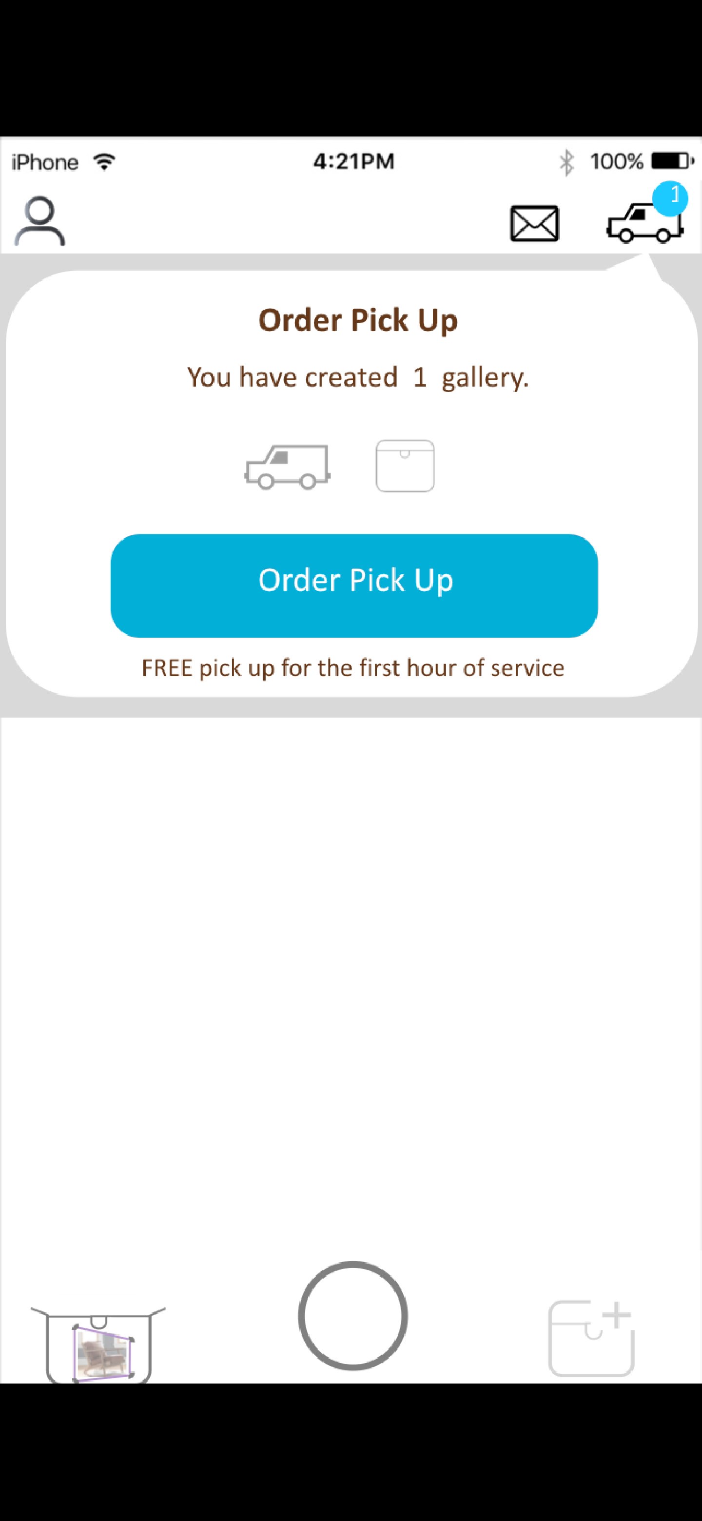
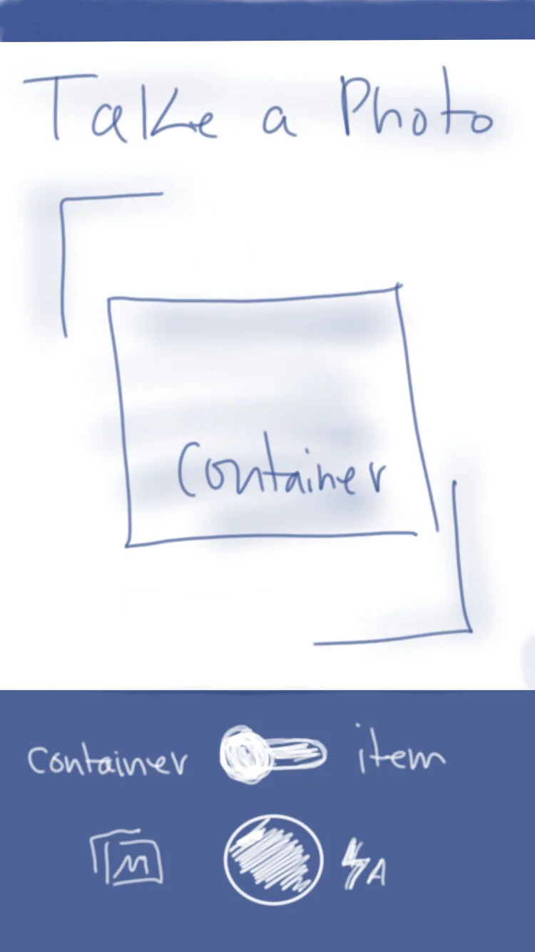
One section of the app came into focus as needing design improvements because it exhibited multiple examples of the issues listed above: the user flow involving the inventory and labeling of items (for both customer and mover). Given that movers and customers inventory so many items in a move, this functionality will be heavily utilized.
Design
I chose to focus my efforts on the inventory items user flow and began with some hand sketched wireframes which I expanded into an interactive prototype.


Refinement
The video below is a screen recording of the interactive prototype demonstration.
Next Steps for Mylo
In order for the Mylo app to continue to evolve into a product which users can easily and instinctively navigate.
The app should be examined with an eye for consistency of UI elements across pages.
Buttons should provide feedback for the user by changing states when activated.
Important messaging and calls to action should be elevated within the hierarchy of each page through the use of color and typography.
Help text and prompts should remain visible through careful use of color contrast and typography.
I created the style guide below, using the existing Mylo visual identity, to help encourage consistency in future design efforts.